Time for Transformation: The Story of Rebranding My Business
When I started my business, I knew I needed to have a logo. I sat in the lounge with my husband brainstorming this one evening and he came up with the concept of a clock in a hand as I was giving time back to my clients by supporting them with admin.
A decade ago, this concept was ideal for my business and a graphic designer skillfully transformed it into a logo that not only looked fantastic but also perfectly matched what I envisioned.
As time marched on, so did my business. The logo that once encapsulated my ethos began to feel less representative of the evolved brand identity my business had developed over the years. Acknowledging this, I reached out to Cherry Anderson, a local graphic designer, to embark on a rebranding journey.
Laying the Foundation for Rebranding
We began by focusing on the heart of my business – my ideal client. This persona has evolved over the years and it was crucial to revisit and redefine who I was speaking to through my brand.
My ideal client is now a female entrepreneur, over 35, who embodies authenticity and compassion. She is a solo business owner, driven by integrity and a sense of community. Her goal is not just to succeed in business but to make a meaningful impact on the lives of others. She needs my services not only for the technical aspects but also for the support and partnership I offer.
This understanding was pivotal in shaping the direction of the rebrand and the focus then shifted to how I could connect with this ideal client. My clients need me to simplify the complexities of technology, implement their visionary ideas and offer a supportive ear. It’s this blend of authenticity and flexibility that sets me apart in a competitive market.
Next, we distilled my brand essence into ten words:
- Authentic
- Passionate
- Compassionate
- Trustworthy
- Integrity
- Simplification
- Support
- Flexibility
- Community
- and Partnership
Each word was chosen carefully, reflecting the multifaceted nature of my services and my approach to client relationships.
 The final piece of our exploration was assessing my existing brand identity. While my branding had been effective for the past nine years, it no longer fully resonated with my current values and the message I wanted to project.
My logo, once a perfect representation of my business, needed to evolve just as my business had. This realisation was the catalyst for the creative process that followed, leading to the development of a new logo and brand identity that truly reflected who I am as a business owner today.
The Journey from Concept to Final Design
The journey of conceptualising and designing the new logo with Cherry Anderson was an eye-opening experience. Cherry’s initial concepts suggested the use of floral symbolism, a creative direction that beautifully mirrored the feminine aspects of my brand.
This is what Cherry said: “I feel that there are some feminine aspects to your brand and you want to appeal to women – after absorbing your brand photography and immersing in all that you do, it felt right to look at the symbolism in certain flowers – I chose these ones as I wanted something to represent your nurturing qualities as well as the clarity and focus you bring to your clients.”
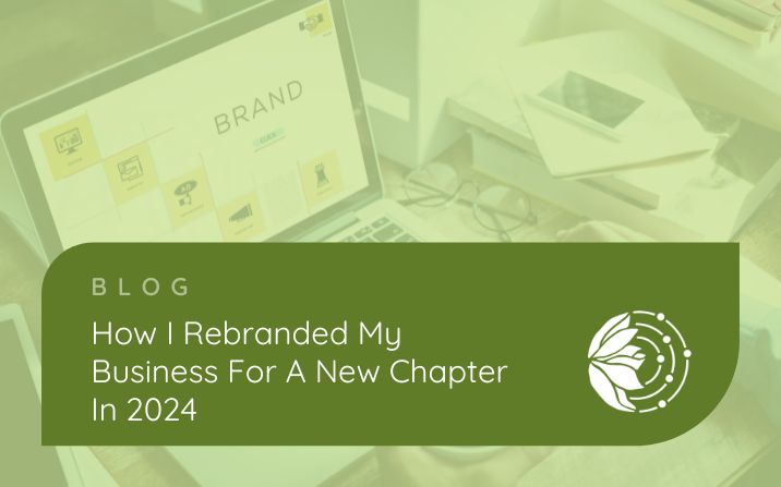
After exploring various options, we chose the digital magnolia as the centrepiece of the new logo. This choice was deeply personal and meaningful. The magnolia, a favourite of my husband, symbolises much more than a mere floral preference. It stands for endurance and perseverance – qualities that are the lifeblood of any business owner.
In the realm of Japanese flower symbolism, known as Hanakotoba, the magnolia is revered for representing dignity and a profound love for nature and the sublime. These attributes deeply resonate with the ethos of my brand, which is built on a foundation of integrity, authenticity and a deep-seated respect for the natural flow of business and relationships.
Cherry also ingeniously incorporated dots into the logo. which are a visual representation of clarity, focus and the methodical approach I take in my work, bringing calm and order to the clients I work with.
The chosen colours and fonts for my new logo were carefully selected to complement the brand photography crafted by Ursula Kelly in 2022. The palette we settled on is calm, sophisticated and supportive – a reflection of the environment I strive to create for my clients. The green, initially a colour I was uncertain about, symbolises growth, renewal and the nurturing aspect of my services. It’s a colour that speaks to the heart of what I do – helping businesses flourish and thrive.
Aligning Brand with Vision – the Rebranding Journey is Complete
This rebranding journey has been a transformative experience, marking a significant milestone in the life of my business. The new logo is more than just a symbol; it’s a narrative that encapsulates the journey, the values and the aspirations of my business.
This new branding aligns perfectly with the sophisticated, nurturing and supportive nature of the services I offer, ensuring that every interaction with my brand is a true reflection of its essence. The results resonate not just with me but, more importantly, with my clients – both existing and prospective. It communicates the essence of my services, the values I stand for and the commitment I have to my clients.
I have loved the process of rebranding and am so excited to be able to visually grow as a business owner.
If you are looking for someone to rebrand, I can highly recommend Cherry, she is exceptional at understanding what you need even when you don’t know. She is professional and friendly at all times and has a clear process that she follows for her clients. This made working with her easy and she has been able to capture the essence of my business and create a strong visual brand to represent it.