Now I’m not a graphic designer and wouldn’t never profess to be, but wow isn’t Canva amazing at making us all fantastic at design?! Here is a lovely image I created especially for this blog!
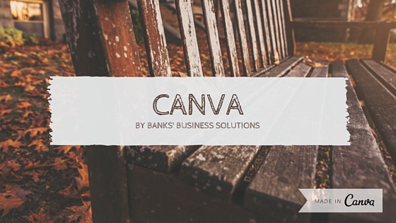
Of course creating this was easy, I used a pre-installed template, changed the text and added the ‘made in Canva’ image! No graphic design skills needed there then.
Before I go on I want to say that I think graphic designers do an amazing job and there is no replacing them for good quality image and printed product production.
Canva is a great tool however for producing simple images to use digitally across your website and social media channels. It gives you the tools to enhance what would otherwise be a very boring text based post. I recently provided some training on Canva for a client and she was the inspiration for writing this post as I know there are a lot of you out there who are battling with Canva and a few simple tips can make all the difference, so here goes.
My top 3 tips
1. The first thing to do when getting started is select the right design size for your finished image. Once you get started you can’t resize your design (unless you use Canva for work) – Canva comes with a number of preset sizes or you can use your own custom dimensions.
2.  You need to understand that when using Canva you are bringing together elements in different layers with different effects. This image was created using an image in a square grid with a ‘whimsical’ effect, the text and line sit on a 40% transparent white box and the text is formatted with font ‘Playfair Display’ in colour #421c0d
3. Canva is free only if you use your own elements, it has some great (and not so great) preset templates which can give you ideas but if you use any of the elements with a $ sign you will need to pay to download your design.
Creating a simple quote graphic for using on Facebook
So now you have my top tips let’s work through creating a simple quote graphic that you can share on Facebook.
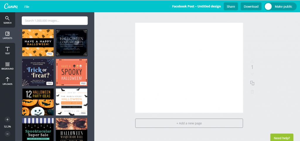
Step 1: Select the Facebook post design template in Canva, and you’ll be presented with this lovely blank canvas to get started with:
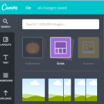
Step 2: Decide on the background for your post – this can either be a plain block of colour, an image or a preset background from Canva. Let’s use an image – firstly go to ‘grids’ and select the full image grid for the post.
Then upload the image you want to use and drag it onto the grid on your design.
Step 3: Add a white box with 40% transparency to put your text on – go to shapes and select a plain square by clicking on it. Position it where you want the text to go on your image and click on the arrow to alter the transparency:
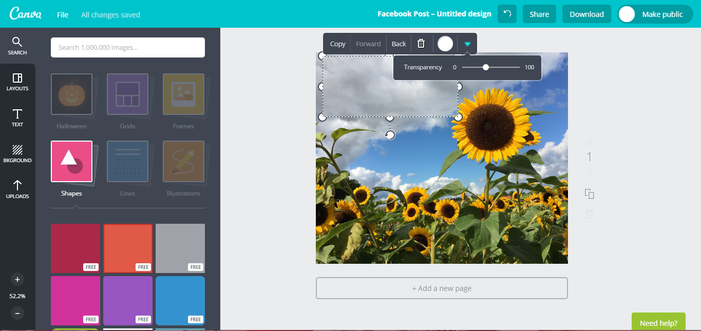
Step 4: From the ‘text’ option click and drag in your text box – it doesn’t matter too much which you choose here as you will be resizing it anyway!
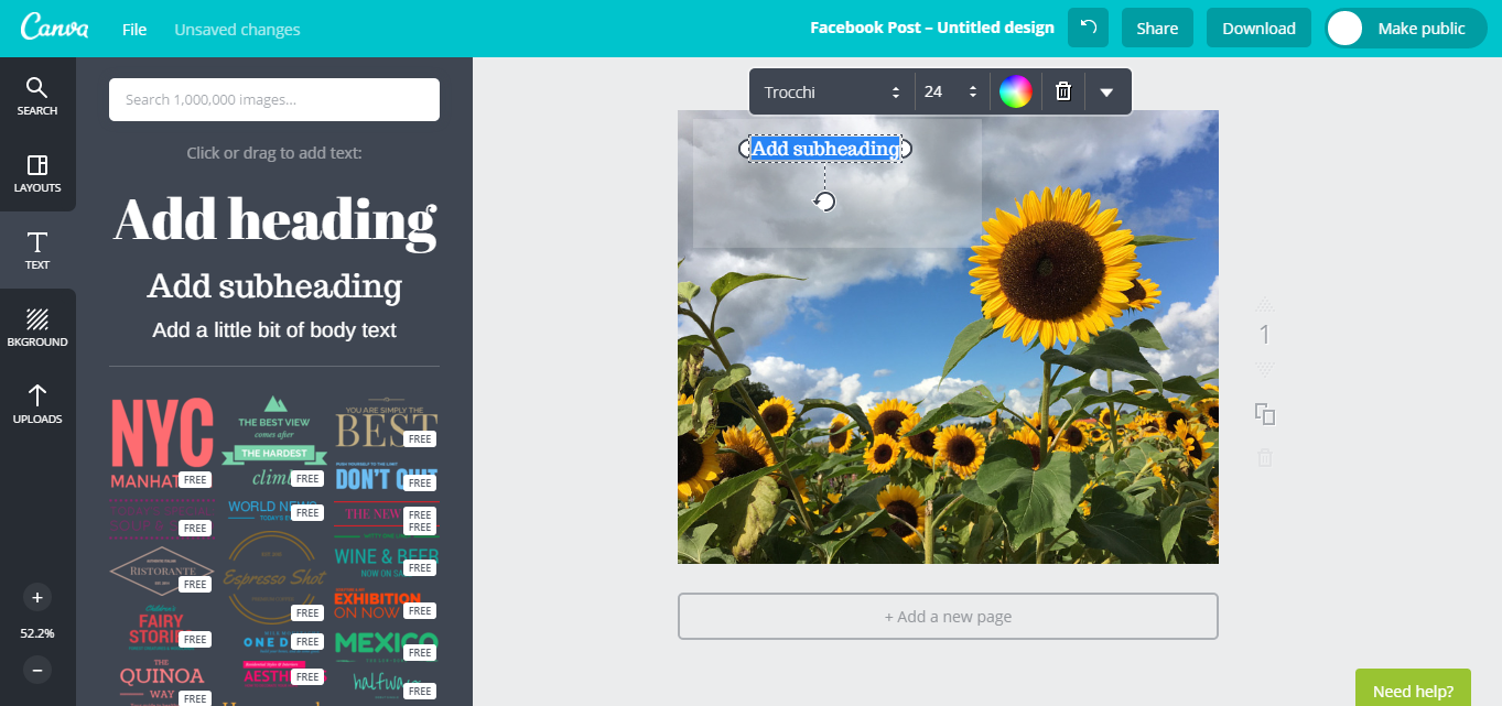
Change the font to match your brand – for inspiration check out the Canva blog: ‘Build Your Brand: How to Choose The Right Fonts‘ Replace the text with your quote. Use a complimentary font to add the author of the quote below it.
Step 5: Ensure that you include details of your brand somewhere on the image – I usually put mine in the bottom right corner.
Step 6: Download your file as an ‘image for web’ – this ensures it is the correct size for displaying on Facebook.
The final image looks like this: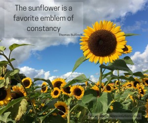
I hope that you have found these tips useful, I am more than happy to answer any questions you might have about using Canva, and would love to hear from you. I plan to launch some Canva videos in the next couple of weeks so please do sign up to my newsletter at the bottom of this page so that you can be the first to hear about them.
